
Source: Clive Maund for Streetwise Reports 08/06/2018
Technical analyst Clive Maund charts gold and notes it has just entered into its most bullish season of the year.
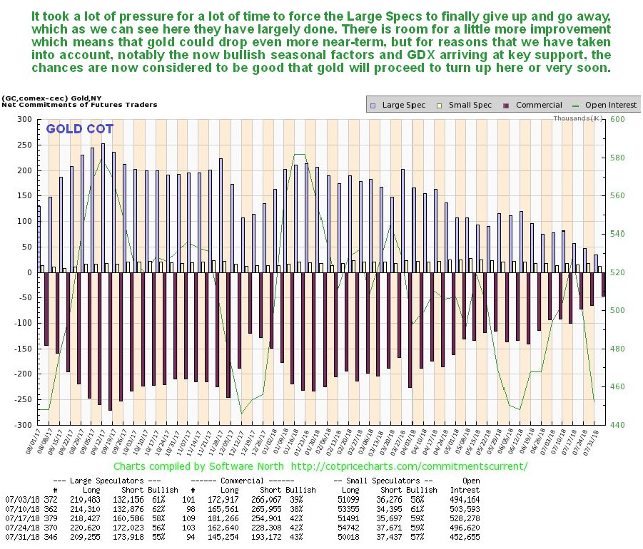
Gold has had a rather hard time of it during the past several months, as we can see on its latest 1-year below, but its drop has been proportionate to the rally in the dollar, and is therefore unremarkable. What this drop has achieved, which is a useful precursor to a recovery, is to finally flush out the Large Specs, who, after outstaying their welcome, have finally packed their bags and left. This we can see on the latest COT chart, which is stacked right below gold’s 1-year chart for direct comparison.
Click on chart to popup a larger, clearer version.
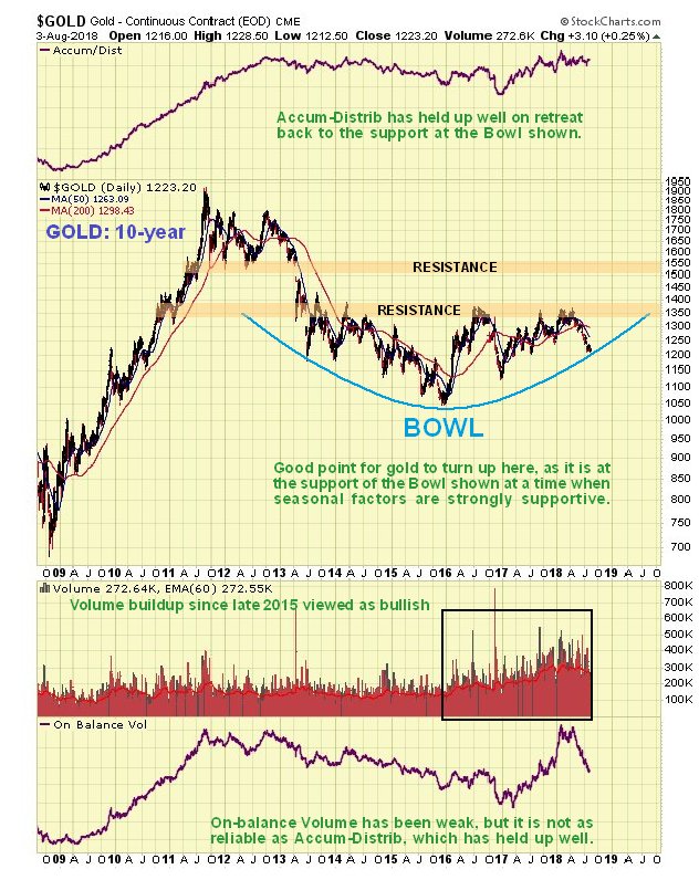
Points worth noting on these charts include the following: gold is now oversold on its MACD and relative to its moving averages and when you couple these facts with the now cleaned up COT and strongly bullish seasonal factors now in play that we will look at shortly, we can see that there is a strong case for gold turning up here, which implies that the dollar will soon drop, so we will look at that later too. The positive divergence of the Accum–Distrib line relative to the gold price over the past couple of weeks is worth noting too.
Taking all of the above into account it is thus very interesting to observe gold’s latest 10-year chart on which we see that its price has dropped down to arrive at the support of a giant Bowl pattern, so, again, this is a very point for it to turn up. The pattern in gold since early– to mid-2013 may also be described as a complex Head-and-Shoulders bottom which is not shown here as it would make the chart rather messy, and the Bowl pattern suffices to define what is going on, at least for now.
Seasonally, it could not look better for gold as it has just entered its most bullish time of year, and here we should note that seasonal factors are an important influence for gold, with heavy buying in India ahead of the wedding season being one important factor behind it.
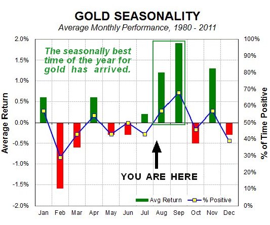
Chart courtesy of sentimentrader.com
The Gold Risk Levels chart, a new one for us, shows, as its name implies, that the risk involved in buying gold here is low. We can see on this chart that there is a good correlation between extremes on it and reversals in gold, both up and down. Whilst it could drop a little more to reach rock bottom, which would involve gold dropping back some more, it is saying that gold is either at or close to a bottom here.
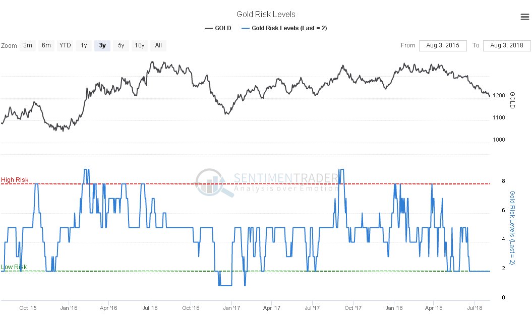
Click on chart to popup a larger, clearer version.
Chart courtesy of sentimentrader.com
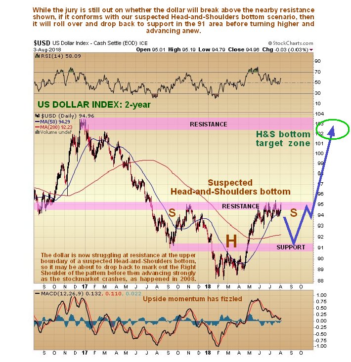
Now we look at the all-important dollar, which alone is responsible for gold having fallen down the stairs in recent weeks. The time frame for seeing to best advantage what is going on in the dollar index chart is a 2-year one. On the 2-year chart we can see exactly why the dollar’s advance has stalled out in recent weeks where it has—it has arrived at an important resistance level at its October–November 2017 peak—and the entire pattern from that peak suggests that a large Head-and-Shoulders bottom may be forming, with the index getting ready to drop down to complete the Right Shoulder of the pattern. While this interpretation may be incorrect and the dollar suddenly resume its rally, this is made less likely by gold’s latest COT, which supports an immediate gold recovery and therefore a drop in the dollar. If the pattern is indeed a Head-and-Shoulders bottom, then it has major implications because it means that the dollar index will later run to a target in the 102–104 area or even higher, which we can expect to coincide with a broad based asset collapse, as in 2008. After that the emergency measures that we can expect to be implemented by the Fed and other monetary authorities, in the Fed’s case some form of QE4, will usher in a dollar collapse and hyperinflation, which must be the endgame result of years of excess and profligacy.
The storm clouds are already gathering with the news that the property market is starting to stall out ahead of an implosion that will spread across many asset classes. If this comes to the fore immediately then the dollar will continue to advance due to a “dash to cash” without bothering to drop back first.
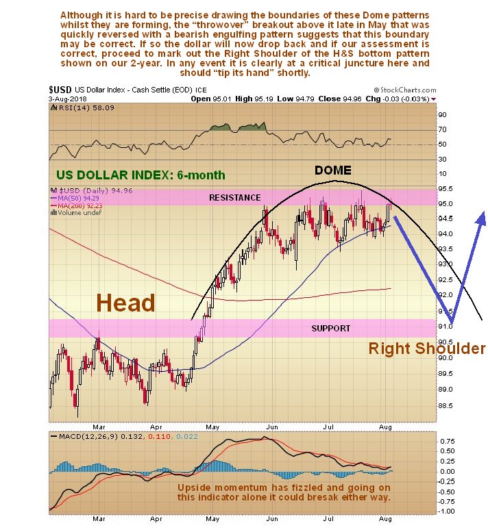
The dollar is thus at a critical juncture and the delicacy of the situation quickly becomes apparent when we look at the latest 6-month chart for the dollar index. On this chart we see that, in addition to stalling out at the aforementioned resistance, the dollar index is rounding over beneath a Distribution Dome, which, unless it negated by a break above it and the resistance level, will soon force it lower to drop back and mark out the Right Shoulder of our suspected Head-and-Shoulders bottom before it then turns higher again to complete the pattern as the broad-based market crash looms.
While gold has dropped back significantly over the past several months, gold stocks, generally speaking, have not dropped back much at all, as we can see on the latest 2-year chart for GDX (VanEck Vectors Gold Miners ETF), and have in fact outperformed gold noticeably. This has bullish implications for the sector, as gold stocks tend to lead gold. The reason that we are looking at a 2-year chart for GDX is that it reveals the importance of the clear line of support at about $21, which turned the price up on no less than five occasions …read more
From:: The Gold Report