This post A 100%-Accurate Indicator Is Flashing: Ignore It at Your Own Peril appeared first on Daily Reckoning.
Very few mainstream investors realize this, but there’s an indicator that has correctly predicted a recession every time it’s gone off going back to the 1960s – seven times in total.
And right now, this indicator is flashing bright yellow.
Based on history, if it turns red we will see a painful economic contraction by next year.
So today, I want to give you a plain-English explanation of this critical measure called the yield curve.
In general terms, a yield curve shows how various bonds’ interest rates compare to each other.
But when most people talk about the yield curve, they are specifically referring to the rates offered by Treasuries with different maturities.
To get an idea of how this works, picture a continuum with very short-term Treasuries at one end and 30-year bonds at the other. In between is everything else, such as two-year notes and 10-year notes.
As you’d imagine, the standard shape has higher rates the farther you go out on the curve.
After all, the longer an investor locks up money, the more risk he’s taking… and the higher his annual rate of compensation should be.
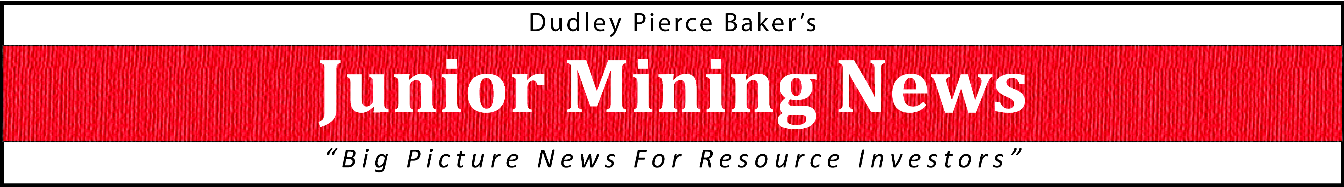
Here’s a pretty standard pattern from five years ago, during the summer of 2013…
As shown, investors were getting almost nothing for holding very short-term bills and substantially more the farther out on the yield curve they went.
This is an economic green light – the market’s way of saying, “Everything looks pretty good. We expect decent economic growth, stable interest rates, and moderate inflation.”
The standard difference between a three-month note and a 20-year Treasury bond has historically been about two percentage points, so the curve above was actually a bit steeper than average – with 20-year bonds offering 50% more of a spread than they usually do.
But the basic idea was that the bond market saw blue skies ahead… and we now know it was correct about that.
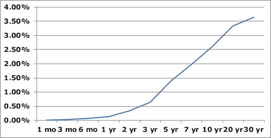
Of course, here’s what the same yield curve looked like back in 2008…

As you can see, the overall shape is much flatter.
In fact, investors who tied their money up for just one month in 2008 were getting a 3.31% yield… while investors who tied their money up for 30 YEARS were getting just 4.35%.
That’s a meager one percentage point in additional interest for locking up money three decades longer!
This shape amounts to market uncertainty about the future, which makes perfect sense when you think about what was happening during the financial crisis.
And we have a similarly flat yield curve right now.
You can get official rates for every point on the curve right here via the Treasury’s website.
By doing so, you’d see that…
A three-month bill was recently yielding 2.00%…
A 3-year note was paying out 2.76%…
A 10-year bond was paying only slightly more at 2.96%…
A 20-year bond was almost the same at 3.03%…
And locking up your money for a full 30 years would get 3.09%.
So we’re talking about a total spread of less than .4% between a 3-year bill and a 20-year bond, which you now know is a fraction of the normal two percentage point spread.
That means we’re very much in “yellow” territory right now.
Should shorter-term rates go higher than longer-term ones, we’d be seeing a situation that led to a recession seven out of seven times since the 1960s.
The last time this happened, in November of 2006, here’s what it looked like…
Depicted above, it’s clear investors could actually get HIGHER interest rates by buying shorter-term bonds.
This is known as an “inverted yield curve,” and it means the market expects turbulence ahead.
In many respects, it actually becomes a self-fulfilling prophesy.
Why?
Just think about the U.S. financial system for a minute.
The general way things work is that banks and other lenders borrow at shorter-term rates and loan that money back out at longer-term rates, pocketing the difference.
If everyone is making more money by holding cash rather than lending it, the engine for economic growth starts to sputter!
That’s a very simplified explanation, of course.
And we could still see the curve start heading back to a more normal shape… especially given Donald Trump’s recent calls for the Fed to slow its roll on future rate hikes.
However, this is something that bears watching over the next few months because it has big implications for almost all the investments in your portfolio.
To a richer life,

Nilus Mattive
Editor, Rich Life Roadmap
The post A 100%-Accurate Indicator Is Flashing: Ignore It at Your Own Peril appeared first on Daily Reckoning.
From:: Daily Reckoning