DOW / GOLD – A 98% FALL NEXT
July 26, 2019
by Egon von Greyerz
“The winner takes it all, the loser standing small” (an Abba song) is the next phase in the world economy. Sadly there will be few real winners since the world and its people will be the loser in the coming phase of destruction of asset values, implosion of debts as well as a breakdown of the fabric of society.
I do realise that this all sounds very gloomy, and also that bearers of bad news are not popular. But the world is now facing an inevitable breakdown of the biggest debt and asset bubble in history. It is absolutely certain that this will happen, so it is in my mind not a question of if but only when.
EVERYBODY WILL LOSE BUT IMPORTANT TO LOSE LESS
Although we will all be losers to some extent, there are be some who are better protected than others. And the few people who understand this will be the winners in the investment world.
This week I want to make the message simple. There is one graph that tells the whole story of what will happen in the next few years. Anyone who “gets” this chart also understands what is going to happen. But there is only a minuscule percentage of maybe 0.5% of the investment population who would even look at a simple chart that could be the difference between misery and fortune. This means that over 99% of the investment world will not be prepared for what is coming next and most of these people will see a destruction of their assets to an extent that has never occurred previously in history. Their journey will end up in miseries whilst the few who take the tide that leads to fortune will have secured their financial position.
There is a tide in the affairs of men.
Which, taken at the flood, leads on to fortune;
Omitted, all the voyage of their life
Is bound in shallows and in miseries.
On such a full sea are we now afloat,
And we must take the current when it serves,
Or lose our ventures.Shakespeare – Julius Caesar
STOCKS VS GOLD – A VICIOUS FALL COMING
The chart I am talking about is the stock market compared to gold. I will take the US market as the example but the ratio chart gold versus stocks could be applied to most stock markets in the world.
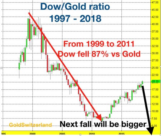
If we first look at the Dow/Gold chart since 1997, we find that it topped in July 1999 at 45. This means that one unit of the Dow bought 45 ounces of gold. It then crashed by 87% to 6 in 2011. Since then there has been a steady recovery to the 20 level. In technical terms that means a very normal 38% correction.

So 19 years after the Dow/Gold top in 1999, the stock market is still extremely weak measured in real terms or real money which is gold. And this is in spite of a major recovery in stocks since the 2009 bottom. This bodes ill for stocks. Whether the correction goes a bit higher than the 20 level is irrelevant. The chart shows that stocks have recovered in nominal terms due to massive money printing. But in real terms, stocks are in a long term downtrend since 1999 and this downtrend will soon resume with a vengeance.
DOW GOLD – FOUR CRASHES SINCE 1837: 70%, 90%, 96%, 87%
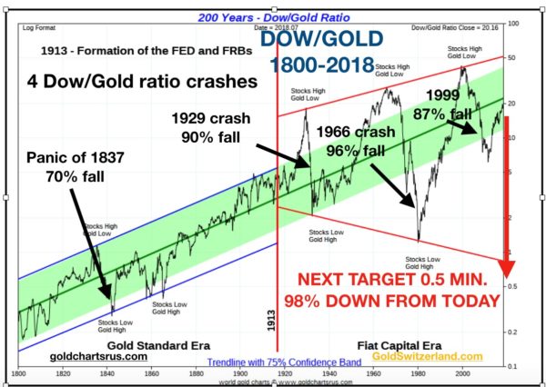
To understand the longer trend we need to look at a long term chart since 1800. The chart below shows that stocks have been in a long term uptrend against gold for 200 years. This is the natural consequence of the real growth of the world economy fuelled by industrialisation and the discovery of oil. Between 1800 and 1913, the swings of the Gold/Dow ratio were relatively small with one exception. But with the foundation of the Fed and modern central banking the swings became much greater.

PANIC OF 1837 – 70% FALL
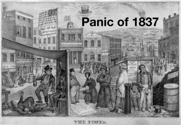
The biggest crisis in the 1800s was the Panic of 1837 which lasted until 1844. As with all crises, this one was preceded by a major speculative bubble with stock and land prices surging together with commodities like cotton and also slave prices. This led to a deflationary crash and a depression with high unemployment and bank failures. Out of 850 US banks, 343 closed entirely and 62 failed partially. During the 7 year crash, the Dow/Gold ratio declined by 70%. This was by far the biggest decline of the ratio in the 19th century.

CRASH 0F 29 – 90% FALL
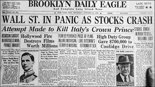
The next big fall was after the stock market Crash of 1929 when the ratio fell 90%. Thereafter it went up 14 fold to a top in 1966. The next big drop was 96% with Dow/Gold reaching 1 to 1 in 1980. Then the biggest surge ever in the Dow/Gold ratio started with a 45 fold increase between 1980 and 1999. Stocks boomed and gold declined. That 1999 peak is likely to stand not just for years but for decades. (see chart above)

DOW/GOLD – A 98% FALL COMING
The big Megaphone pattern in the Dow/Gold ratio since 1913 completed on the upside in 1999. Between 1999 and 2011, the ratio crashed by 87%. This is not the end of the down trend. The next big move will at least reach the bottom of the Megaphone. I would be surprised if the ratio doesn’t go well below the 1 level it reached in 1980. More likely is 1 Dow to 1/2 ounce of gold or lower. (see chart above)
A fall of that magnitude will involve a stock crash from …read more
From:: Common Stock Warrants

