
Source: Clive Maund for Streetwise Reports 06/06/2018
Technical analyst Clive Maund examines recent movements in the gold market.
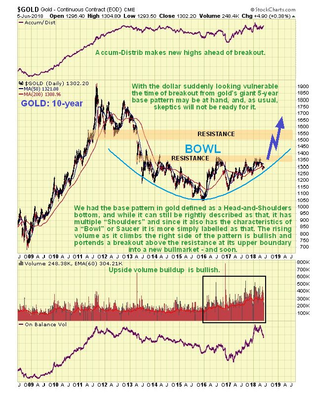
Gold’s breakout from its giant 5-year base pattern has had to wait for the dollar rally to run its course, which it now appears to have done, and this being the case, gold is now free to break out into a major bull market that looks set to dwarf all prior ones. We have in the past described gold’s base pattern from 2013 as a complex (multi-shouldered) Head-and-Shoulders bottom and while this description is still valid, it is perhaps more simply described as a Bowl or Saucer pattern, that is shown on its latest 10-year chart below. For one of these patterns to be valid, volume should build as the price starts to rise out of the Saucer, and as we can see, that is indeed the case, and with the price now being driven by the ascending Saucer boundary towards the resistance that marks its upper boundary, breakout looks imminent. If we stop and think about the growth of debt and money supply while this giant base pattern has been building out, it is clear that gold has a lot of catching up to do.
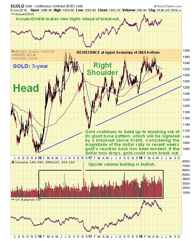
Given that gold’s base pattern can also be described as a complex Head-and-Shoulders bottom as mentioned above, it is easier to look at it in terms of that on a 3-year chart. On this chart we see the Head of the pattern and the messy Right Shoulder and that gold’s overall trend is now up, with it being driven at the key resistance by the trend lines shown and also by the rising Bowl or Saucer boundary, which it is not practical to show on this chart, but which from glancing at the 10-year chart, we can see is now approximately where the upper trend line is. Breakout must occur within a few months, and while it could happen at any time, the best time for it from a seasonal perspective would be August–September. While this may seem like a long time to impetuous types, it’s not after a 5-year buildup, and any time remaining to breakout affords us the luxury of being able to buy up the best stocks and adjust portfolios, etc., so that we are able to reap the maximum advantage from the bull market, which will feel even better, because while most precious metal sector investors will be making money, the majority of the population will be getting poorer in a hurry. Before leaving this chart it is worth observing that gold has held up very well in recent weeks, given the magnitude of the dollar rally during this period, which is a positive sign.
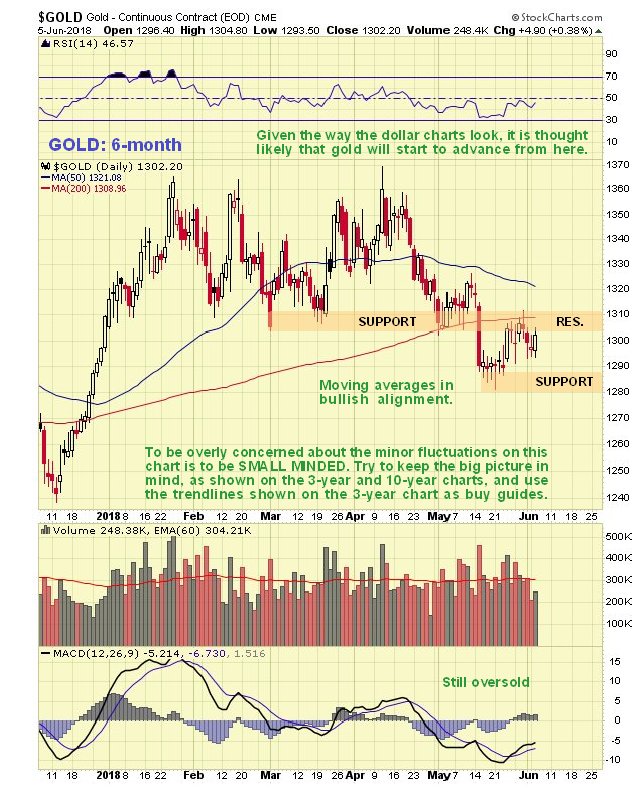
The 6-month chart shows us recent action in more detail, but otherwise it is of little use technically, and is actually deceptive, because it shows gold trending lower, but we know that longer-term charts reveal that the larger trend is up. On this chart we see that moving averages are still in bullish alignment, but there is an impending bearish average cross if the price stays down, so we will want to see it advancing again soon, which is what we are expecting.
Gold’s latest COT chart showed some deterioration last week, which could lead to a minor dip, but overall we have seen an improving trend in readings since late January, with Commercial short and Large Spec long positions moderating from fairly high levels. While readings could be better, they are not at levels that would prevent a breakout by gold from its giant base pattern, and there is scope for improvement in coming weeks ahead of the breakout, if it doesn’t happen immediately.
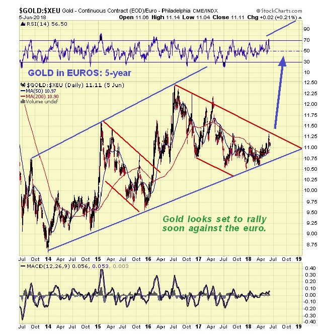
It’s always interesting to look at gold in other currencies. On our 5-year chart for the gold in euros, we see that it near to the bottom of a large uptrend channel and looks set to rally back towards the upper boundary again. Given that the dollar looks set to drop back, which implies a recovery rally in the battered euro, this further means that gold should rally even more against the dollar.
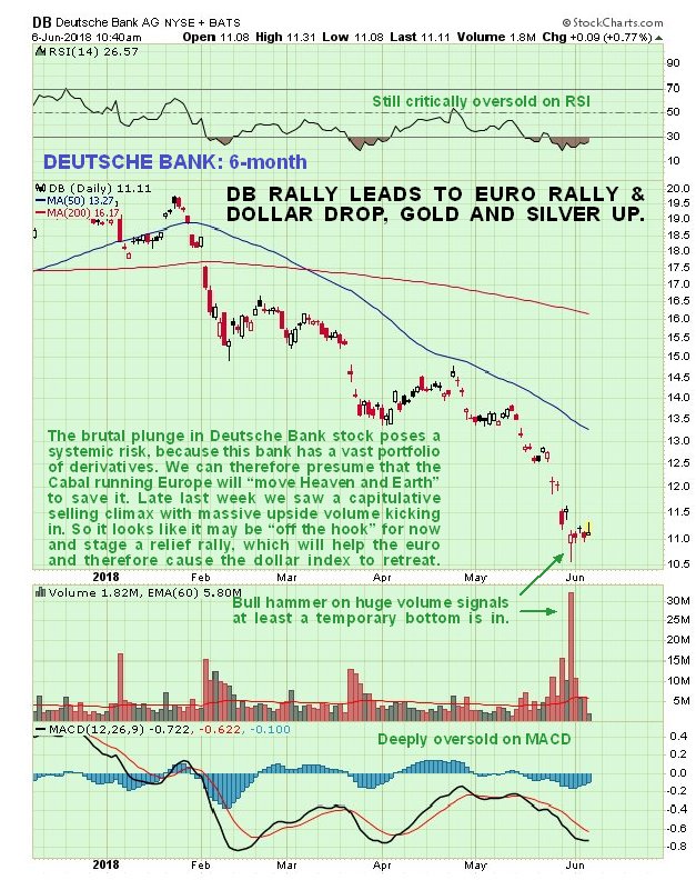
For the euro to recover, we need to see an easing of the acute crisis centering on beleaguered Deutsche Bank, especially as this bank holds vast quantities of derivatives and thus constitutes a major systemic risk. So it relevant here to see what the charts are saying about Deutsche Bank stock. The latest 6-month chart for Deutsche Bank is actually encouraging and implies an easing of the banking crisis in Europe, at least for a while, for as can see the stock plunged into a high volume capitulative selling climax late last week, that left behind a bull hammer on the chart, and although the price range of the hammer was not impressive, volume was and suggests that it is done falling for now and could soon rally, which would probably lead to a rally in the euro too. We can presume that the Cabal running Europe will “move heaven and Earth” to stop it crumbling further.
Turning now to the dollar we know that it has had a strong rally since the middle of April, which we will examine not on the chart for the dollar index itself, but on a 2-month chart for the reliable dollar proxy, the Invesco US Dollar Index Bullish Fund, code UUP, the reason being that we can observe its volume pattern and volume indicators. The rally in UUP (and thus the dollar) from the middle of April has taken the form of bearish Rising Wedge, which shows an advance that is losing impetus, and thus at growing risk of reversing. Early last week there was an interesting and bearish development when UUP gapped out of the top of this converging channel, only to gap back into it the next day on much heavier volume, action which left behind …read more
From:: The Gold Report