This post The Market’s Got It Wrong appeared first on Daily Reckoning.
Janet Yellen’s mantra is, “It’s transitory!”
That’s Yellen’s typical response to a long litany of data that shows the U.S. is in the grip of a powerful disinflationary trend that may lead to outright deflation — a central banker’s worst nightmare.
The Fed has a publicly announced 2% inflation goal, which they consider to be price stability. In fact, 2% inflation cuts the purchasing power of the dollar by 75% in the course of an average lifetime. The Fed would tell you to ignore that.
Why 2% inflation is considered “price stability” is a subject for another day. For now, let’s just accept the Fed’s definition and see how the Fed responds from a policy perspective.
The Fed carves out food and energy prices from inflation. That gets to something called “core” inflation.
The Fed’s preferred metric is calculated monthly by the U.S. Commerce Department as the personal consumption expenditure (PCE) deflator. The Fed’s preferred interval is monthly data compared to the same month one year earlier, or “year-over-year,” YOY.
With a 2% target for PCE core YOY, what’s the actual time series of data? Here it is:
December 2016: 1.9%
January 2017: 1.9%
February 2017: 1.9%
March 2017: 1.6%
April 2017: 1.6%
May 2017: 1.5%
June 2017: 1.5%
July 2017: 1.4%
August 2017: 1.3%
An objective analyst would give the Fed credit for coming close to their target in late 2016. This is precisely why the Fed embarked on a path of rate hikes. The Fed raised interest rates in December 2016, March 2017 and June 2017.
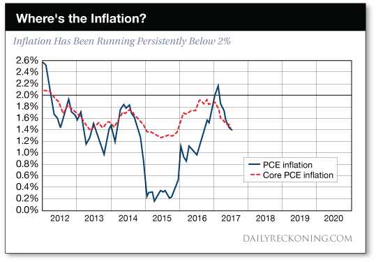
The chart below is taken from a presentation given by Janet Yellen on September 26, 2017. The black horizontal line is the Fed’s 2% inflation target. The blue line represents actual PCE inflation; the red line represents PCE “core” inflation with food and energy prices removed, (the Fed’s preferred method). The downward trajectory of the red line should be disturbing to the Fed, but is routinely dismissed as “transitory.”
What happened next?
To answer that question, bear in mind that monetary policy works with a lag. That insight is one of Milton Friedman’s few economic contributions that has stood the test of time.
The Fed has been tightening in fits and starts since Bernanke’s “taper talk” in May 2013. This has resulted a consistent pattern in which Fed tightening slows the economy, then the Fed flips to ease, and the economy picks up steam, which leads to another round of tightening, and another slowdown.
Wash, rinse, repeat.
The Fed’s late 2016, early 2017 tightening cycle has now come home to roost. In the latest nine-month time series, shown above in the table and chart, inflation was flat or down in every month, and dropped a total of 0.6%.
That’s huge. The Fed’s range for this purpose is 0% to 2%. The floor is 0% because the Fed must avoid deflation. The ceiling is 2% because that’s the Fed’s announced target. A 0.6% drop covers 30% of the target range. It’s a quite significant …read more
Source:: Daily Reckoning feed
The post The Market’s Got It Wrong appeared first on Junior Mining Analyst.

