
By Cory
An Unexpected Change In Gold’s Seasonal Trade Pattern
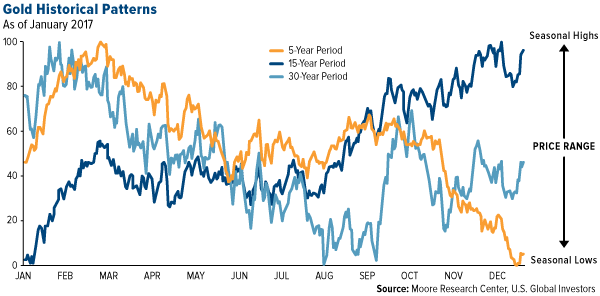
Investors of all sorts talk about seasonality. While some focus a lot on how markets react during certain times of the year this “analysis” is not the best to depend on. Frank Holmes outlines the discrepancy for the gold sector that we are currently experiencing. Now you should consider that the yellow line on the chart (below) is only a 5 year trend and over that 5 years we have been entrenched in a pretty bad bear market. Longer trends are more valuable however what is most important is determining the type of market that we are currently in and investing based on that.
Click here to visit Frank’s U.S. Global Investors website for more valuable articles.
Here at the outset, I want to share with you an interesting observation we made this week of gold’s seasonal trading pattern. As you can see in the chart below, based on data provided by Moore Research Center, the five-year pattern, represented by the orange line, is diverging from the longer-term trends. Note that the index on the left measures the greatest tendency for the asset to make a seasonal high (100) or low (0) at a given time.
click to enlarge
The data show that lows are now reached late in the year, not in January (according to the 15-year period, represented by the dark blue line) or August (according to the 30-year pattern, represented by the light blue line). Historically, September has seen the highest returns on gold as Indians make huge purchases in preparation for Diwali and the fourth-quarter wedding season, but lately we’ve seen changes. When we calculate the average monthly returns of the past five years, from January 2012 to December 2016, we find that January is the strongest month, returning 5.3 percent, following by August with 2.3 percent. September actually returns negative 1.3 percent.
There could be a number of reasons why this is, but it’s important to recognize that the five-year period captures the bear market that dragged gold from its high of $1,900 an ounce in August 2011 to a recent low of $1,050 in December 2015. The years 2013, 2014 and 2015 all saw negative returns, so it’s little wonder why the orange line trends down from February-March to December.
Inflation Props Up Gold
Consumer and producer prices rose in April compared to the same time last year, favoring gold prices going forward. Consumer goods climbed 2.2 percent, down slightly from March’s 2.4 percent. Wholesale goods, meanwhile, flew up 5.3 percent, higher than economists’ expectations and the strongest year-over-year increase in nearly six years.
click to enlarge
On numerous occasions I’ve shown that higher inflation supports demand for gold, which has often been seen as a safe haven investment. The money you have sitting in the bank right now is guaranteed to lose value over time. The five-year …read more
Source:: The Korelin Economics Report
The post Frank Holmes – Mon 15 May, 2017 appeared first on Junior Mining Analyst.