
Source: Clive Maund for Streetwise Reports 08/06/2018
With oil nearing $70 per barrel, technical analyst Clive Maund looks at what may come next.
By the end of next year, the United States is set to become the world’s biggest oil producer. Once you grasp this, you understand that it has an incentive to promote higher oil prices, both to further its own oil industry and to generate big fat profits for the oil majors and bulging bonuses for oil company executives. The potential downside of driving the oil price higher, from the standpoint of those in control, is that designated enemies such as Iran and Russia might also benefit from these higher prices. So the way to prevent that from happening is to subject them to sanctions and oil export restrictions. The ordinary U.S. motorist facing stiff price hikes at the pumps can go fly a kite.
The predictions made in the last Oil Market update I wrote nearly three months ago, on 12th May (too long ago) turned out to be correct. We were looking for a near-term reaction and then an advance to new highs, and that is what happened, although it then proceeded to react back again during the first half of July and we will now proceed to consider the outlook.
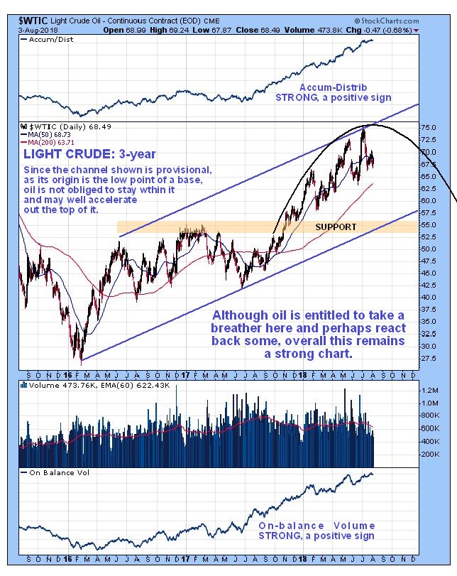
On the latest 1-year chart for Light Crude we can see that the reaction back during the 1st half of July was nothing out of the ordinary, and it has brought the oil price back down to support near to the lower boundary of the intermediate uptrend shown, which is expected to turn the price back up again, especially as moving averages are still in quite strongly bullish alignment and the earlier overbought condition has fully unwound, as shown by the MACD indicator. However, on this chart we can also see a restrictive Dome pattern forming whose origins can be traced back to late last September, which may prevent the next rally getting as high as the upper return line of the uptrend channel before it turns down again, and we can get a better perspective on this Dome pattern by looking at the 3-year chart, which puts it in the context of the entire bullmarket advance to date from the early 2016 low, following the severe “crush Russia” bear market that preceded it and resulted in a lot of oil workers in the States being forced into idleness.
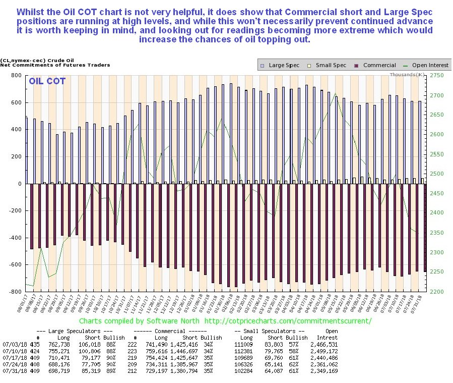
While the oil COT chart is not as useful as COT charts for other commodities, because it does make anywhere near such wild swings, it does reveal that Commercial short and Large Spec long positions are at relatively high levels historically. While they are not at levels that will necessarily prevent further gains, they put us on notice that should they climb to greater extremes a deeper reaction back will become more likely. A reaction back across the channel shown on the 3-year chart below would result in these readings easing to healthier levels.
Click on chart to popup a larger, clearer version.
On the 3-year chart we can see clearly why oil’s latest uptrend is running out of steam here. In the 1st place this intermediate uptrend has been in force for about a year now without any significant correction, which is quite a long time. Second, it now appears to be at the top or apex of the Dome that we already saw on the 1-year chart, which could force it lower soon, although as mentioned above it could first make a run at the Dome boundary. Third, we can see that a much larger potential channel exists, and it is viewed as no coincidence that the price is rounding over beneath a Dome pattern whose upper limits are roughly at the top of this channel. It could react back as far as the lower boundary of this large channel, currently at about $54.00, without damaging the long-term bullish picture. At this point a reaction this deep doesn’t look likely, and it should be pointed out that oil’s bull market could accelerate, since the origin of this channel is the low point of the giant base pattern, which means that it may be too shallow so that the oil price accelerates out the top of its requiring that a new steeper channel be drawn on the chart. Note also that these Dome patterns often only contain the price temporarily before it busts out the top into a new uptrend.
The very long-term 12-year chart gives us a most useful overall perspective. On this chart we can see the huge run-up in the oil price during 2007 and early 2008 that was followed by a more dramatic selloff occasioned by the 2008 market crash. The price then made back a good portion of the losses caused by the crash, peaking again in 2011, and then chopped sideways for years before plummeting in 2014 in the “crush Russia” crash, which was a concerted attempt by Saudi and the U.S. to force Russia to the wall, which didn’t work. What it did do is cause the price to drop to even lower levels than at the trough of the 2008-2009 market crash, resulting in thousands of U.S. oil workers being thrown out of work. After this severe decline to a low level a downsloping Head-and-Shoulders bottom formed, which the price broke out of into a new bull market just last Fall. Going just on price alone this new bull market looks rather anemic and like it may peter out and reverse into another bear market before much longer, and while we can expect this to happen if we see another 2008 meltdown, the heavy volume driving this advance and the resulting strong volume indicators suggest that there is a lot of power behind this bull market, which could take the oil price a lot higher if the general market …read more
From:: The Energy Report